Since it first starting publishing in January 1993, Wired magazine has been breaking ground with regards to the design of the publication. I remember picking up the latest issue at Nini’s corner in Harvard Square — I couldn’t wait to see what metallic or florescent ink popped off the cover. It was exciting. And so is this. As editor Chris Anderson puts it on wired.com this new digital version will be complete with “lavish design to glorious photography, while augmenting it with video, animations, additional content and full interactivity.” The video does an amazing job of showing the features of this new format.
[pulledquote]lavish design to glorious photography…[/pulledquote]
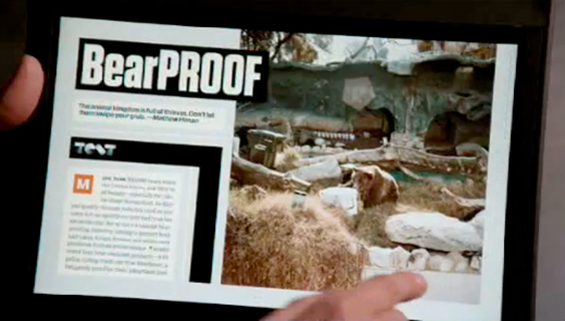
The interviewees explain the scrubber, the browser, and social features that allow the reader/user to clip articles and post to social media websites. One of the stand-out interactions is a clip of a user clicking on different thumbnail images in an article that in turn changes the article’s opening image. The user as designer/art director. As I’ve noted before on The Design Shift, the designer in this scenario will have to select multiple successful feature article images and not just one as would be the case in the print edition. If you’re already using an iPod Touch or an iPhone then you’re familiar with the kinds of interactions and gestures. The next challenge for designers will be to consider those experiences as they design interfaces for this kind of content.
Leave a Reply